
Wednesday, 29 February 2012
Tuesday, 28 February 2012
Double Page Spread Conventions

Double page spread conventions
This is a double page spread from NME magazine and I am deconstructing the article to see what conventions I can include in my article.

Large main image taking up all of one of the two pages.

The title is in BLOCK s e p a r a t e d text to make it clear and draw attention to it.
The colours are predominant as well.

The billboard is smaller but still of a fairly noticeable size.
___________________

The large letters at the beginning of articles are often a very common convention. One thing about this particular magazine is the random larger letter included in this article, which I think is quite unconventional -

___________________

there is a smaller, secondary image. I think it makes the article more interesting and I often find that the more images there are on an article, the more people are drawn to it. It also allows the reader to get a sense of what the article is describing or talking about.

There are conventional columns with a large extract of text in the middle separating the text into more 'digestable' sections of reading, as people will usually pick up a magazine for light reading.
The large quotation in the middle gives the reader an insight into the article and adds to the desire to read on with the article as the reader wants to find out about the quote etc.
Monday, 27 February 2012
Media Test Shots & Recce
I took some practice shots. Unfortunately, the images weren't showing up on my blog!
click here to look at the images on Flickr stream.
I took them to figure out what kind of background and surroundings to the images I am going to eventually use. I am not necessarily going to be including these images in the final drafts but they have given me a good idea of what images I want to include.
For the front cover, I don't think any of these images particularly suit conventions of a front cover. I want to keep it simple with one main image, therefore I don't think a brick wall, for example, would work.
I do like the close up of a guitar, and this would feature nicely on a double page spread, and then the full body shot images featured in it also. These images have helped give me an idea of the kinds of pictures I will take.
Thursday, 23 February 2012
SHINDIG!

After looking at mainly mainstream magazines, I am going to look at a magazine that appeals to a much more niche market that is very narrowly broadcasted. Shindig only sells 26,000 copies a month, this is most likely due to the very selective genre of music it covers, which includes psychedelia, garage, beat, power-pop, soul and folk. Another reason is due to the limited number of issues released. Bi-monthly it publishes 6 issues a year, and at £4.95 per issue, the cost would be another factor due to the limited sales whereas NME and other mainstream magazines can afford to lower their prices due to the popularity. However I do believe people would be willing to pay this due to the obscurity and non mainstream factor of it.
Shindig! advertise themselves quite selectively, and this must be the case as nobody (except Mr.Swain) has heard of it! They are however, on Facebook and Twitter, so they are in social networking contact with their readers and people could stumble across it in this way.

The front cover of shindig! is very simplistic and looks like something you would expect to see in the 60s or 70s. I think that this is what people like about it, as it would remind them of the 'good old days' and reflects the bands that are influenced by this era and those that were from that era as well!
They do not fit much classic magazine conventions, for example, there are no sell lines on the left or right side leaving it looking quite bare, possibly to really bring the artists to full attention.
The bright obscure colours also contrast against the black and white picture and looks quite 'hippie' influenced.
Wednesday, 22 February 2012
My Target Reader.
I have determined in more depth my target audience for an indie magazine using SAGEL.


The socio-economic group would be middle class people, probably leaning towards upper middle, as these are people regularly attending gigs, festivals and the relaxed way of life would not come cheaply! The age of these people would be in the range of late teens and early twenties, probably 17 - 25.
The gender would be both male and female audiences, however the girls would not always be stereo typically 'girly' and the boys not stereo typically 'butch'. The ethnicity would be white caucasion in this region. The singers are often white, folky people, however any ethnicity really would read this if they so desired and is open to all. The lifestyle of the readers who take interest in this genre would be university students or just students in general, fitting in with the age bracket. They would be quite scruffy in style with a non-perfected look. They would be a party-goer on a regular basis, often attending gigs and festivals with their friends, being very sociable in social networking media too, such as using twitter and facebook on a regular basis. I am pretty confident in saying that they would have an Ipod or a mp3 device and would constantly be listening to their indie tracks whenever possible! Examples of artists they would have on their Ipod would be ; -The Kooks -Noah & The Whale -The Wombats -The Vaccines -Bombay Bicycle Club .... to name a few!
An example of the typical male and female audience I would attract with the magazine
Mood Board

This is a mood board I created collecting a variety of images I believe to be associated with this genre, both the music that is produced by and for 'indie' people, but also images that reflect their lifestyles. They appear to be quite outdoors-y, they often appear scruffy yet clean, they are quite relaxed people with messy hair, guys with beards and stubble and generally a rugged look about them and by looking at these images I can see these reoccurring themes in the images as a whole and therefore has given me tips on what kind of style I can go for in the indie magazine I will produce and has particularly helped with the front cover image idea.
Monday, 20 February 2012
Memes and Tropes - Classical music.
To broaden my study of a variety of musical genres I decided to look into the world of classical music.
Classical singers are often very sophisticated, generally older people. As well as creating their own songs, they tend to produce their cover versions of classical songs, such as the well known 'Ave Maria' and many more.
Coming from someone who isn't a keen listener of classical music (and this sounds awful) , but I find their voices all abit similar and it is more of a harder skill to sing in this way and the songs are almost a display of their talents. Usually people stereotyped to listen to this genre are those who are of the older generation and those who we would stereo typically imagine in a box watching and listening at the royal opera houses with those funny binoculars.
On a more serious note, The songs are often sung in another language, like Italian. Perhaps the reason why, in the UK, classical music is not a very popular genre compared to rock or pop. Also the lyrics are not very relate able to everyday people and their lives, possibly increasing the dis-interest. The music style is quite easy listening with instruments from an orchestra band in the background. Harps and Violins are very much associated with the classical voice style. These delicate stringed instruments reflect the often religious, hymn-like quality the songs are about - perhaps another reason why it is not totally popular, as we live in a world today with a mixture of religions and beliefs, whereas these songs appear to be strictly of a Christian / Catholic origin.
Friday, 10 February 2012
Memes & Tropes - Indie
Memes and Tropes of indie music.
Indie music is very much artists and bands who aren't necessarily glamourous or totally musically talented. These artists sing about a variety of realist issues and don't fall into the upbeat, pop style singing about relationships. If they did sing about love and relationships, they would do it in a metaphorical way or totally the opposite and sing about it explicitly and outrageous. This has become a trope for indie musicians; relaxed, scruffy and often speak-sing with a strong sense of guitar music. Their songs reflect quite deep meaningful issues compared to rock bands about death and love, and pop about clubs and love.
Indie bands are not well known and if they become too much in the public eye, they loose this 'indie' feel and lean towards becoming 'mainstream'. People enjoy listening to indie artists due to this un-discovered element they posses as its like the listener has found something not many other people are particularly interested in or aware of and the bands individuality gives the listener this feeling too. Indie bands are not often in the public eye, except for their music, they keep quite secluded and not in the limelight. Reinforcing this idea of being relaxed and not interested in the glamourous side of the music industry.


Thursday, 2 February 2012
History of Music Magazines - Q.

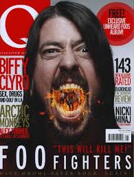
Q is a well known british music magazine under the genre of Indie music, usually leaning towards the the rocky sound of indie.
Q was first published in October 1986. Founded by Mark Ellen and David Hepworth, with the aim to create a monthly music magazine that was different to the other music press with monthly production and higher standards of photography and printing. It is pubished by Bauer Media Group.
The typical content of a Q magazine is quite simple , and the cover is quite versatile, due to the genre of indie being quite random and undiscovered, the magazine adapts to each artist on the cover.
_____
Inside, Q would consist of new musicians, festival information, interviews, chart news and related feature articles.
The house style of Q is quite busy yet consistant with an inner colour scheme of red and white reflecting the logo on the front, farmiliarisng the reader with the magazine. The clutterd style would have stemmed from the type of music included, slightly rocky.
ON THE COVER:
The colour scheme applies to the conventional rule of three colours. Perhaps to reflect what the artist's are wearing that are on the cover, or to reflect their music style. For example Mumford and sons play quite calming, sombre music which is conveyed in the blue tones.
The font being sans serif and looking similar to handwriting looks quite scruffy yet relaxed, which would be reflecting the personality possibly of the readers personality and therefore appealing to them.
This relaxed approach carries on with the cover photo, there is no general positoning to the people on the cover, people are introduced to the musicians and can learn something about them just at a glance, for example the main singer is positioned at the front.
_______
Consisting of 476,000 people, according to NRS readership survey, Q's readers are compiled of 386,000 people in the 15-44 age range, and 90,000 are 45+.
345,000 are male and 132,000 are females.
Q's readers are mainly in the ABC1 class catergory with 316,000 in this catergory
and only 160,000 in the C2DE class. possibly reflecting the pricey £4 it costs!
History of Music Magazines
KERRANG!

The History Of Kerrang -Kerrang is a UK based magazine, predominately aimed towards the genre of rock, heavy metal music. The new wave of British heavy metal in the 80's saw the birth of a mass interest in the punky, rocky genre and Kerrang was founded in 1981.
Kerrang was first edited and produced by Geoff Barton, initially as a one-time supplement in the Sounds newspaper, which focused on the New Wave of British Heavy Metal phenomenon. Published weekly by Bauer Media Group.
Kerrang was first edited and produced by Geoff Barton, initially as a one-time supplement in the Sounds newspaper, which focused on the New Wave of British Heavy Metal phenomenon. Published weekly by Bauer Media Group.
The Typical content of a Kerrang magazine would include a very rocky aggressive attitude. Conveyed through the following aspects;
- The font is informal, it appears quite gruesome. The 'Korn' looks like its been graffitied on, hinting rebellion, possibly reflecting the readers. Similarly the 'Kerrang' font has been shattered, looking broken and aggressive.
- The General layout is quite cluttered and messy.
-The people on the front cover are not very typically 'glamourous' reflecting the conventions of music this magazine is focused on, quite realist in terms of what they sing about, compared to pop which is focused on dancing, glamour and love.
Inside kerrang it would conist of interviews with the rock stars, festival and concert information and instrument relevant information, assuming the readers will too be interested in drumming or electric guitar, for example.
Inside kerrang it would conist of interviews with the rock stars, festival and concert information and instrument relevant information, assuming the readers will too be interested in drumming or electric guitar, for example.
______
Looking at the NRS of Kerrang's readers, the types of readers, with a total of 356,000, are;
mainly in the age range of 15-44 at 313,000 compared to 42,000 who are 45 and over.
The gender audience is more male at 242,000 and female is almost half at 113,000.
Kerrang's house style is overall very rocky and aggressive.
The social groups represented though this magazine as quite rebellious and not really conforming to general life styles.
The magazine is very busy and quite lazily set out, its all quite 'in your face' reflecting the music that the readers would be listening to.
The magazine is very busy and quite lazily set out, its all quite 'in your face' reflecting the music that the readers would be listening to.
Subscribe to:
Comments (Atom)